


Visual Identity Overview
A strong visual identity is imperative because it creates a recognizable and cohesive presence, making it easier for the audience to identify, recognize, and connect with the brand.
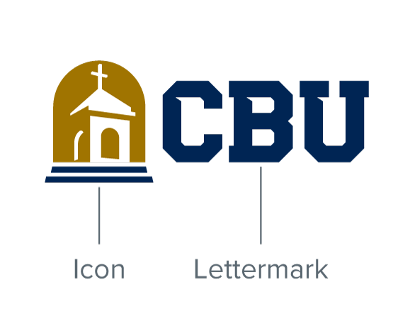
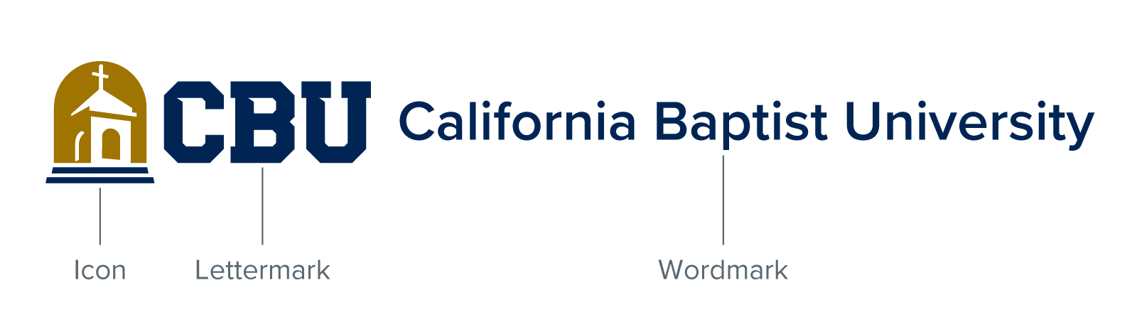
The main visual identity for CBU starts with three foundational graphic elements – an icon, a lettermark, and a wordmark.
From these graphic elements other official CBU logos / marks are systematically created.
Icon
The bell tower icon has been the most consistent graphic element of the CBU brand since its design in 2003. The arched container is an homage to the Mission Revival architectural style of the university and region. The tower silhouette represents the James Building that has been a campus icon for generations. Last but not least, the inclusion of the cross signifies our deeply rooted Christian faith.

Lettermark
The CBU lettermark has seen its share of updates since it became a part of the university logo along with the bell tower icon in 2003.
Combine the lettermark with the bell tower icon to create a logo that represents the institution/university as a whole.
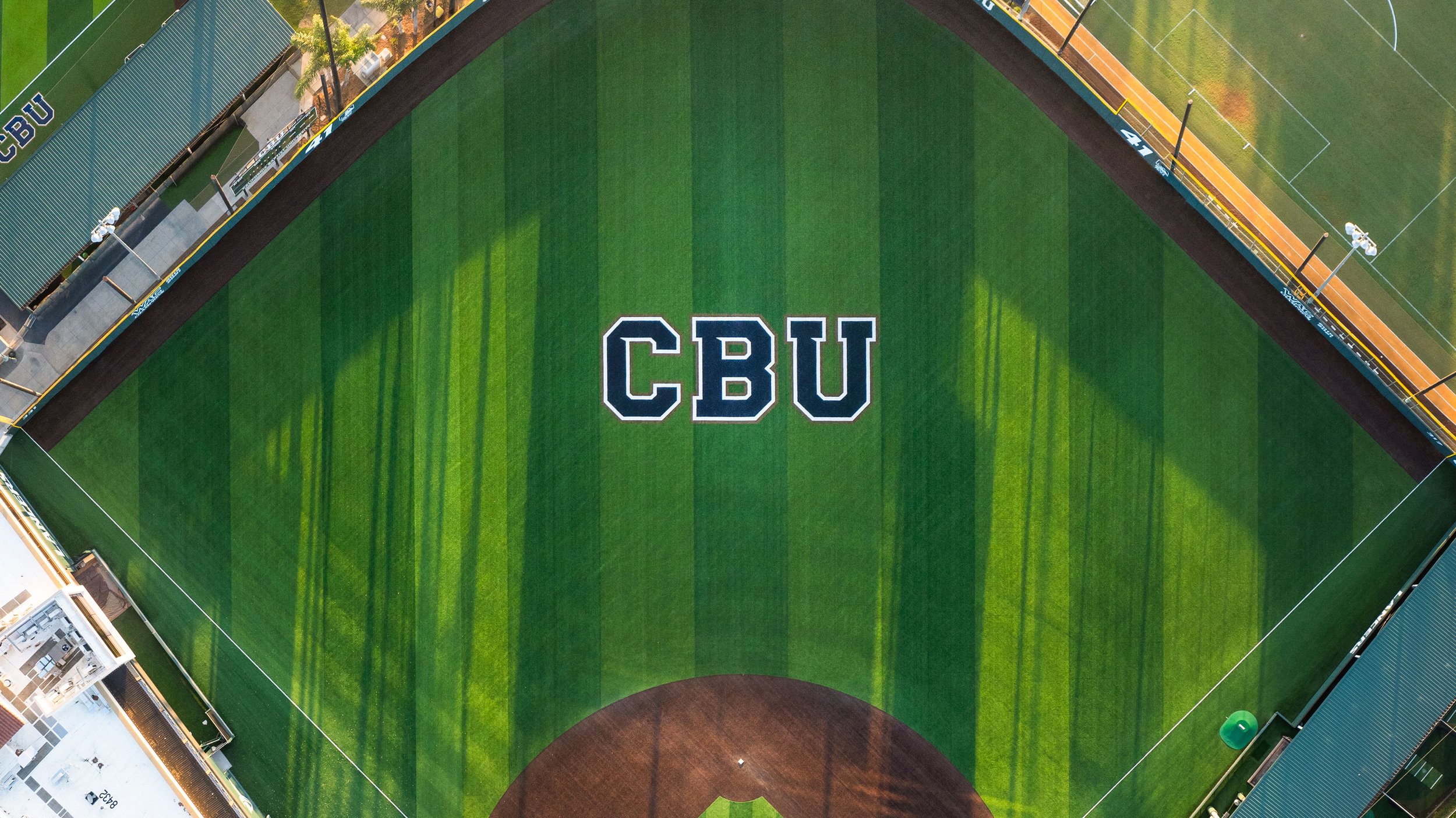
Used on its own without the bell tower, the lettermark represents CBU Athletics.

Wordmark
The wordmark proudly proclaims the full name of our university. If the bell tower icon and the CBU lettermark combination are insufficient for proper brand recognition / identification – including the wordmark makes it overtly clear we are the one and only California Baptist University.
The font used is Proxima Nova Semibold.
Visual Identity System
A visual identity system has been established to provide clear guidelines for brand consistency as CBU grows and expands across different platforms and regions. It allows internal and external teams to easily reproduce and adapt the brand’s visual elements, such as logos, colors, and typography, without losing coherence. This consistency helps maintain a strong, unified brand presence, making it easier to manage and scale across new markets or mediums.
The CBU logo provides the foundation from which all other department / unit logos are created. Official department, office, and unit logos are created by combining / locking up the CBU logo with the unit name / identifier.
CBU logo
3-color (blue, gold, white)
Formal CBU logo
3-color, horizontal lock up
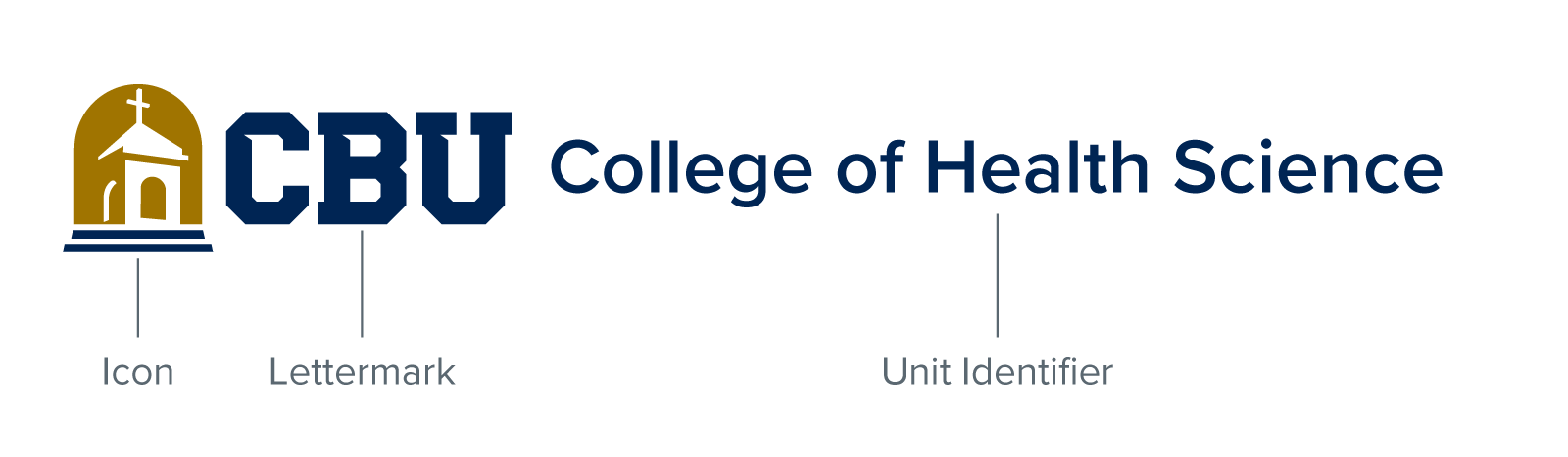
College of Health Science logo
3-color, horizontal lock up
Definitions
Understanding design terms and language is crucial for effectively interpreting and applying the CBU brand style guide. These terms provide clarity on specific design and branding concepts, ensuring that everyone involved shares a common understanding.
-
A lock up is a combination of logos / marks in a specific, fixed, arrangement. Most CBU logos are available in a horizontal or vertical lock up.
-
An icon is a graphic based logo. A strong icon can live on its own and be instantly recognized/associated with the brand (e.g., Apple’s apple, Target’s bullseye, Nike’s swoosh).
-
Lettermarks are letter based logos, usually bearing the brand’s initials. A good and effective lettermark will distinguish the brand from other brands with similar initials (e.g., IBM, NASA, MTV).
-
Wordmarks are word based logos, usually bearing the name of the brand (e.g., Google, Coca Cola, Visa).
-
Identifiers associate the logo with a specific sport, department, division or unit within the brand.