

CBU Athletics
Visual Identity Overview
The visual identity for CBU Athletics starts with three foundational graphic elements – CBU lettermark, Lancers wordmark, and Shield icon.
From these graphic elements other official CBU Athletics logos / marks are systematically created.
Maintaining strict visual identity and brand integrity for CBU Athletics through consistency across all communication channels is paramount. Consistent use of CBU Athletics logos, colors and fonts helps establish a recognizable, cohesive, and unified brand presence in the crowded collegiate athletic environment.
Optimal visual identity is achieved when rules are followed and best-practices are considered. Adhering to this style guide will ensure that the CBU Athletics brand maintains a strong visual presence in every context and scenario.
The following trademarked logos may only be used by athletic units and for retail purposes as determined by the Department of Marketing and Communication.
CBU Lettermark
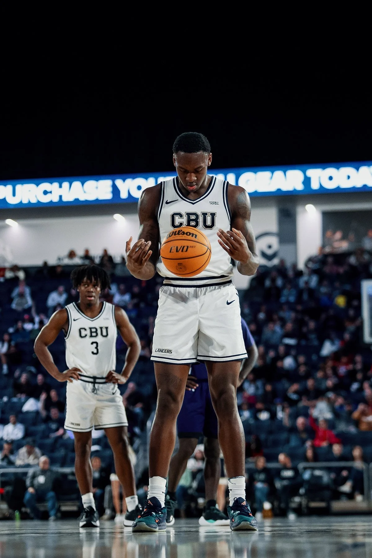
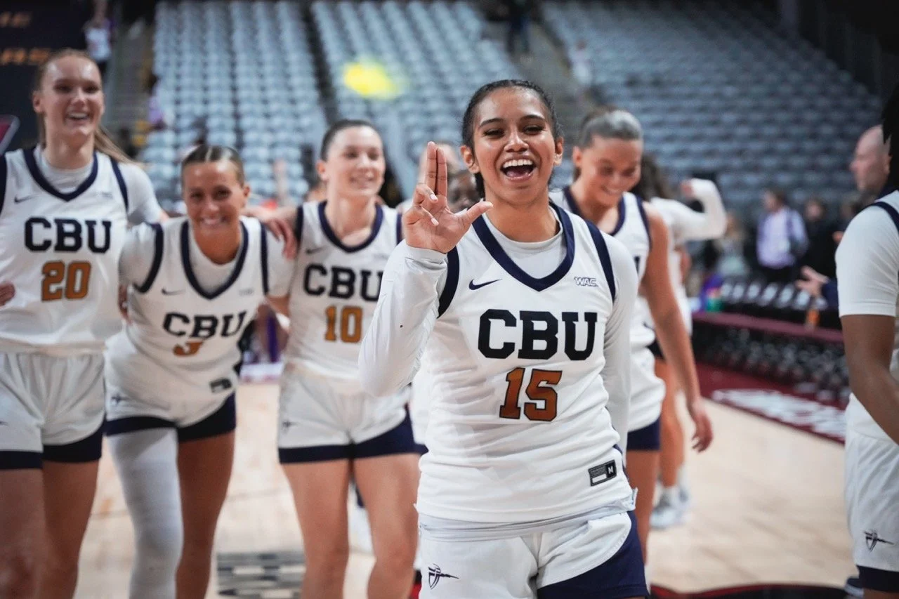
The CBU lettermark is the primary and preferred logo to identify CBU Athletics and athletic units.
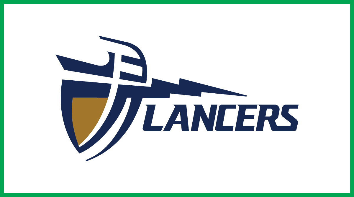
Lancers Wordmark
The Lancers wordmark is a secondary logo for CBU Athletics.
The preferred use of the Lancers logo is when it is accompanied by the primary logo to ensure proper brand association/recognition. Its use separate from the primary logo should be reserved to circumstances where the audience is already familiar with the CBU brand.
Shield Icon
The shield icon is a tertiary logo for CBU Athletics.
The preferred use of the icon is as an accent mark to accompany the CBU lettermark or Lancers wordmark. Due to the abstract nature of the icon, its use as a standalone element should be minimized.
Primary Athletic Logo
The CBU lettermark is the primary and default identifying logo for CBU Athletics.
In contrast to the university logo, the bell tower icon is excluded from the athletics logo to offer more balance and flexibility in situations where the logo may appear (e.g., team uniforms, scoreboard, training equipments, etc.)
Due to the omission of the bell tower icon, the lettermark is deliberately designed to showcase all 3 official university colors - blue, white, and gold. Use the full, 3-color version whenever possible.
A simplified, 1-color logo is available only if the preferred 3-color logo is unsuitable for the intended application.
Preferred Logo
Always use the preferred logo in all circumstances (because all 3 brand colors are represented) unless a simplified 1-color logo is necessary. See below for additional guidance.
Athletics Logo / CBU Lettermark
3-Color | Blue, White, Gold
Athletics Logo / CBU Lettermark - Negative colorway
3-Color | White, Blue, Gold
The preferred use of this color way is on a navy/dark background.
-
Extra large applications (e.g., center court logo, flags, bus graphic, Jumbotron digital signs, etc.)
Layered garment embellishments (e.g., tackle twill sweatshirts)
-
Limited digital applications taller than 600px.
Limited print applications taller than 1”.
3 Dimensional signs depending on production method.
-
Academic, student clubs or any other non-athletic use.
Digital applications shorter than 600px.
Print applications shorter than 1”.
Simplified Logo
See below for additional guidance on when to use this logo variation.
Athletics Logo / CBU Lettermark - Simplified
1-Color | Blue (also available in white)
-
Any embellishment process such as embroidery, that may not be able to faithfully reproduce the 3-color logo due to production limitations
Single color prints on black and white office printers
Engraving, laser etching, die cut vinyl decals, etc.
Cost-conscious screen printing
-
Digital applications
Print applications where the 3-color logo can be used
Branded merchandise if another item of the same style already exists bearing the 3-color logo
Secondary Athletic Logo
The stylized Lancers wordmark is a secondary athletic logo for CBU Athletics. The suggested use of the wordmark is when it is accompanied by the primary mark to ensure proper brand recognition. Its use separate from the primary mark should be reserved in circumstances where the audience is already familiar with the CBU brand.
Use the full, 3-color version whenever possible. A simplified, 1-color logo is available only if the preferred 3-color logo is unsuitable for the intended application.
Preferred Logo
See below for additional guidance on when to use this logo variation.
Lancers Wordmark
3-Color | Blue, White, Gold
Lancers Wordmark - Negative colorway
3-Color | White, Blue, Gold
The preferred use of this color way is on a navy/dark background
-
Any embellishment process such as embroidery, that may not be able to faithfully reproduce the 3-color logo due to production limitations
Single color prints on black and white office printers
Engraving, laser etching, die cut vinyl decals, etc.
Cost-conscious screen printing
-
Digital applications
Print applications where the 3-color logo can be used
Branded merchandise if another item of the same style already exists bearing the 3-color logo
Simplified Logo
See below for additional guidance on when to use this logo variation.
Lancers Wordmark - Simplified
1-Color | Blue (also available in white)
-
Extra large applications (e.g., center court logo, flags, bus graphic, Jumbotron digital signs, etc.)
Layered garment embellishments (e.g., tackle twill sweatshirts)
Secondary logo applications
-
Limited digital applications taller than 600px.
Limited print applications taller than 1”.
3-Dimensional signs depending on production method.
-
Academic, student clubs or any other non-athletic use.
Digital applications shorter than 600px.
Print applications shorter than 1”.
Alternate Logo
The Lancers Shield logo is a lock up combining the Shield Icon and Lancers wordmark.

-
Complementary logo applications if the full, 2-color mark can be faithfully reproduced
Strategic, external use where a strong brand association to CBU already exists
-
All digital applications
All color print applications
Internal, on-campus applications
-
Academic, student clubs or any other non-athletic use
Digital applications shorter than 600px
Print applications shorter than 1”
Tertiary Athletic Logos
Tertiary logos are also available for limited athletic and retail use only.
Shield Icon
The Shield Icon is an accent mark for CBU Athletics. Due to the abstract nature of this mark, it should not be used separate from the primary or secondary athletic logo.
Shield Icon
2-Color | Blue, Gold (also available in white, gold)
Usage Guidelines
Follow the guidelines below to ensure consistency in how CBU Athletics logos are represented across all platforms – reinforcing recognition, recall, and trust. Use the guide to maintain a cohesive look and feel in every piece of content, regardless of who creates it, thereby preventing errors or misinterpretations.
The guidelines below are current as of 2025 and supersede any previously published brand / style guidelines.
1. Use the updated logos
In 2021, the CBU letters received subtle but important under-the-hood letterform improvements to optimize its appearance and clarity, especially on smaller, digital applications such as social media. Use the illustrations below to understand and identify the differences between the old and updated letters. When in doubt, delete any old logo files on your hard drive and re-download the logos.

This overlay highlights the shape difference between the old letters (in red) and updated letters.
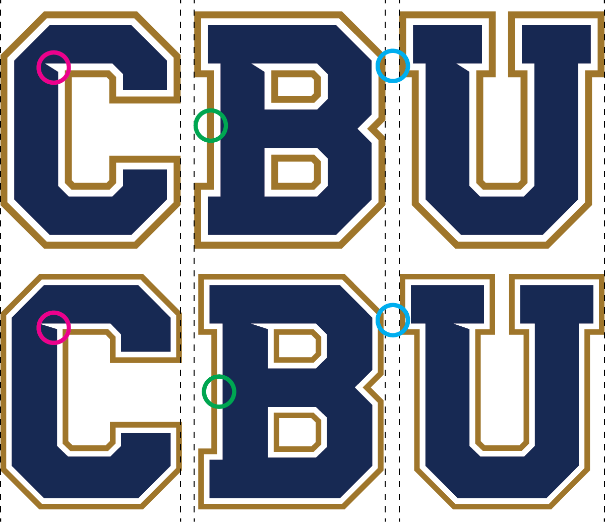
The updated letters (top) have taller notches / ink traps, wider outlines and tighter kerning.
2. Maintain clear space
Give the logo room to breathe by adding clear space. Clear space is defined as the area around the logo devoid of other logos, typography, graphics, and messaging. This area of isolation ensures the logo stands out, and other design elements do not encroach on it, or visually compete with it. Maintain clear space half-as-wide (0.5x) as the height (1.0x) of the logo.
3. Go back to basics
In our effort to establish a unified and cohesive CBU Athletics presence as the program continues its progress in Division I competition, some recent stylistic variations of athletic logos / marks are discontinued from use – effective immediately.
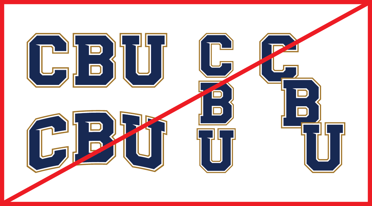
These alternate styles / layout of the CBU Athletics logo are no longer used
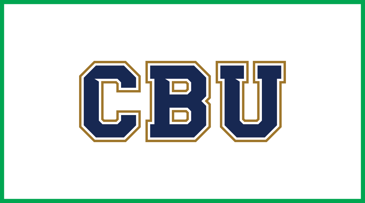
This is the only approved layout for the CBU Athletics logo
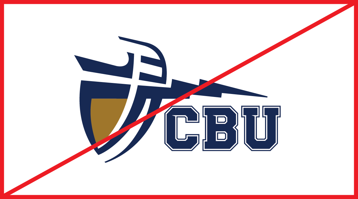
This lock up (Shield icon + lettermark) is no longer used

The shield may be used on its own or as a lock up shown below
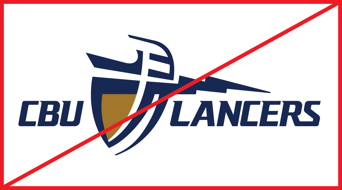
This lock up (CBU text + shield icon + wordmark) is no longer used
This is the only approved lock up for the shield icon and Lancers wordmark
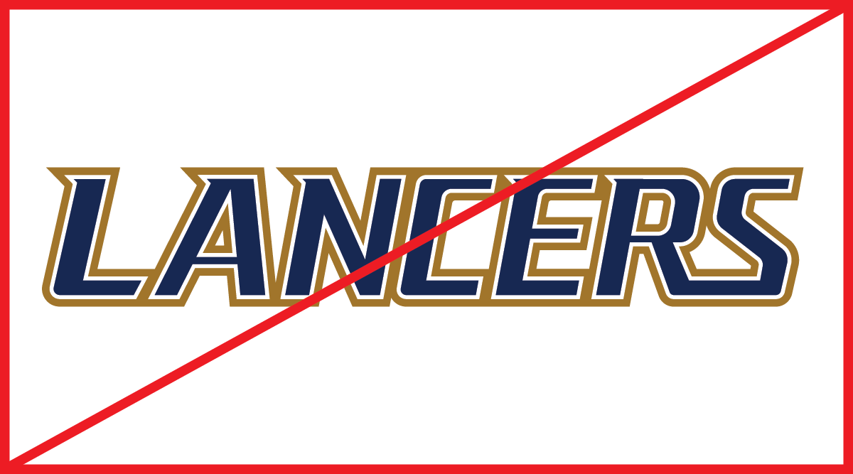
This 3-color Lancers wordmark is no longer used

The updated 3-color Lancers wordmark has been optimized for all applications
4. Never modify the logo
CBU Athletics logos have been spaced and sized deliberately to ensure optical balance and clarity for nearly every application. For that reason, logos should never be scaled, skewed, shifted, or otherwise modified.
Some examples of unapproved modifications to the CBU lettermark are shown below. These guidelines hold true for all other approved CBU Athletics logos. Modifications to any CBU logos to compensate for production limitations must be pre-approved by the Department of Marketing and Communication.

Never change the color order of the logo.

Never change or delete any colors from the logo.

Never stretch the logo.

Never change the spacing/kerning of the letters.

Never add a border, drop shadow or any other stylistic effect to the logo.

Never skew or distort the logo.
5. Always face the Shield Icon forward
The Shield Icon must always face forward in the direction of travel, whenever possible. A couple of examples are shown below. For additional guidance please contact the Department of Marketing and Communication.
On apparel / uniforms where the Shield Icon is mirrored on both sides, one side must be reversed to ensure both icons are facing the same direction.
On vehicles where the Shield Icon is mirrored on both sides, one side must be reversed to ensure both icons are facing the same direction.
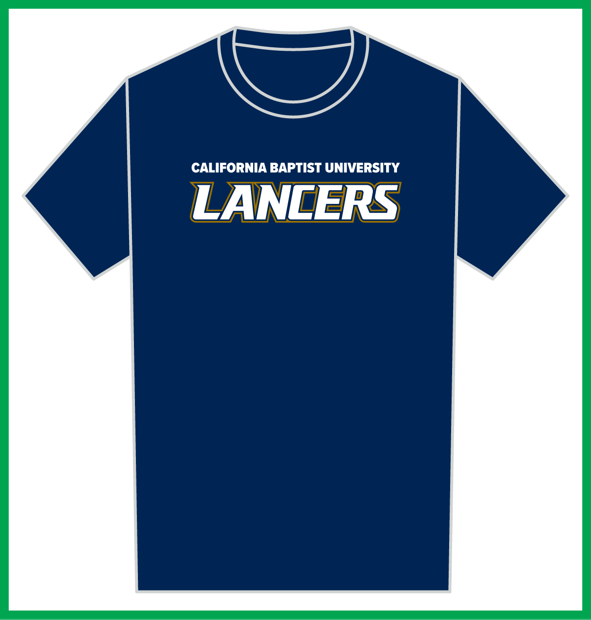
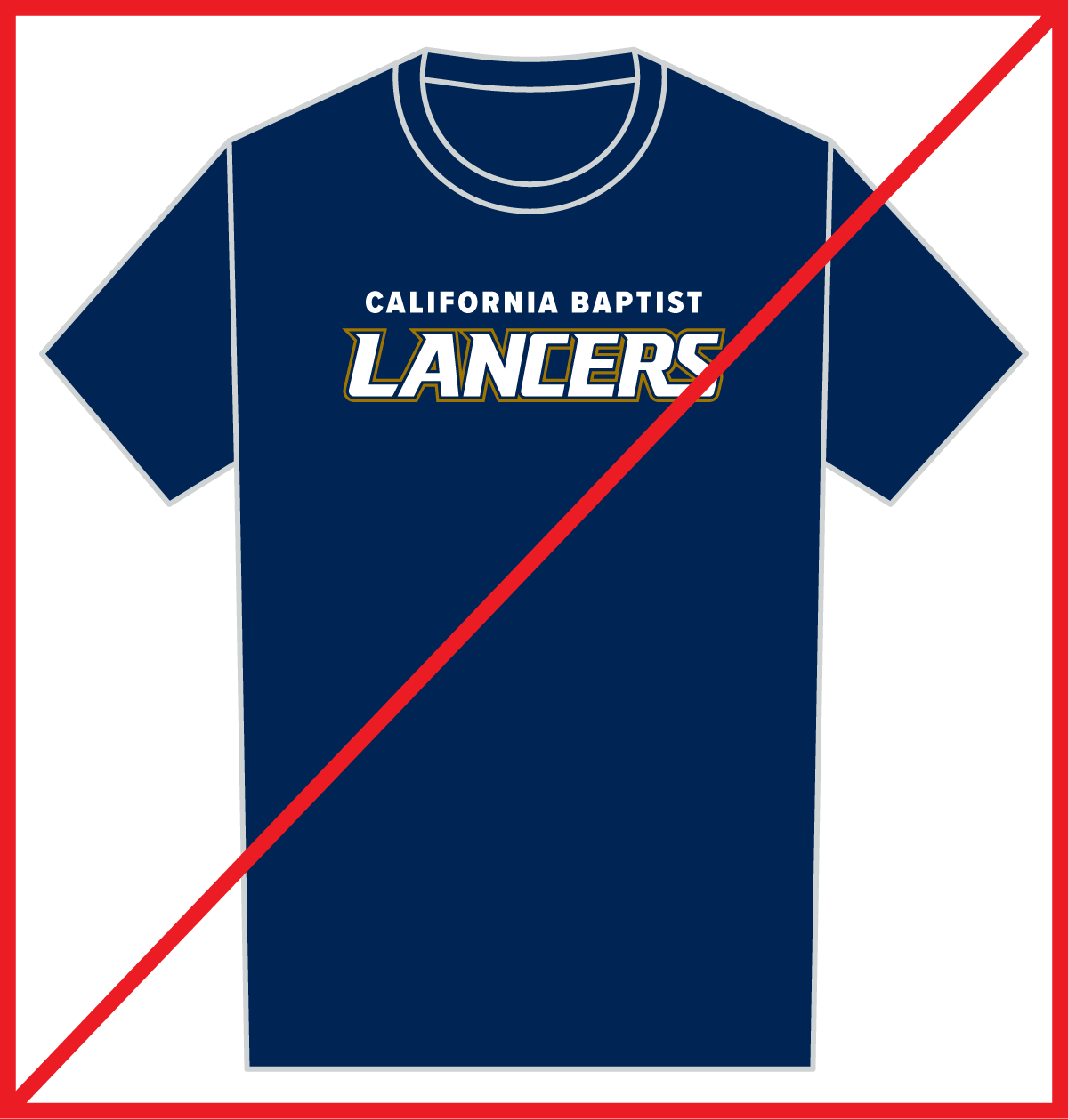
6. California Baptist University not California Baptist
All reference to our institution must include the word “University”. E.g. “California Baptist University Lancers” or “California Baptist University Women’s Basketball” for proper brand recognition/attribution. In specific circumstances, such as a sports broadcast where there is sufficient contextual knowledge, omitting the word "University” may be permitted.
7. CBU Athletics not Lancer Athletics
In copy, the athletic program/department at California Baptist University is referred to as “CBU Athletics” not “Lancer/Lancers Athletics.”