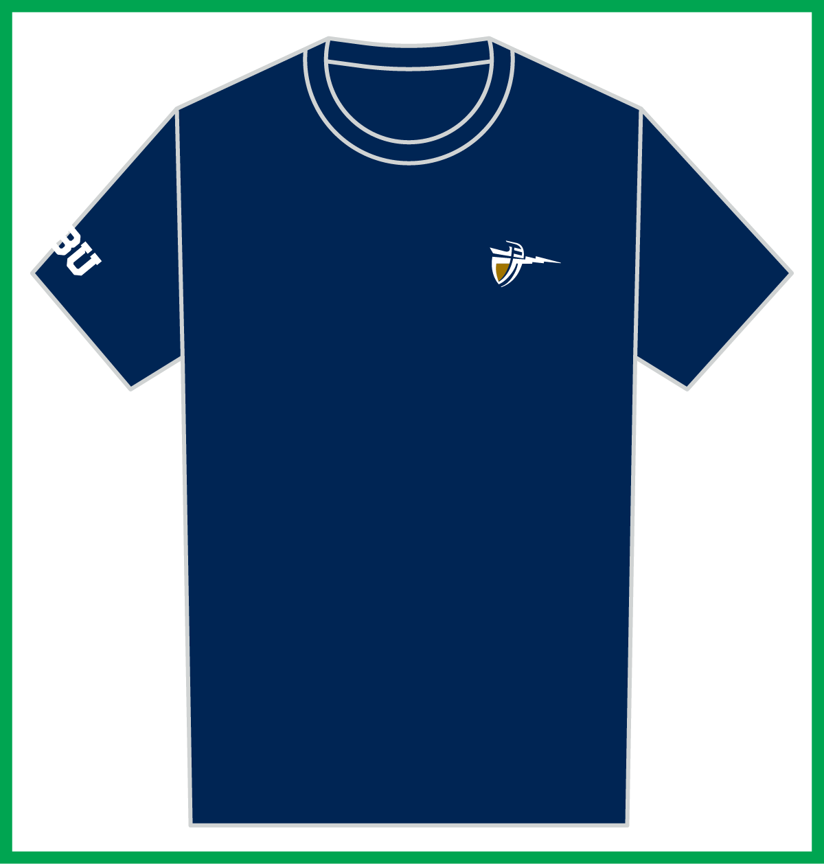
Sport Logos
Sport logos are official marks that represent official collegiate athletic disciplines at California Baptist University.
Logos are created by combining the following design elements:
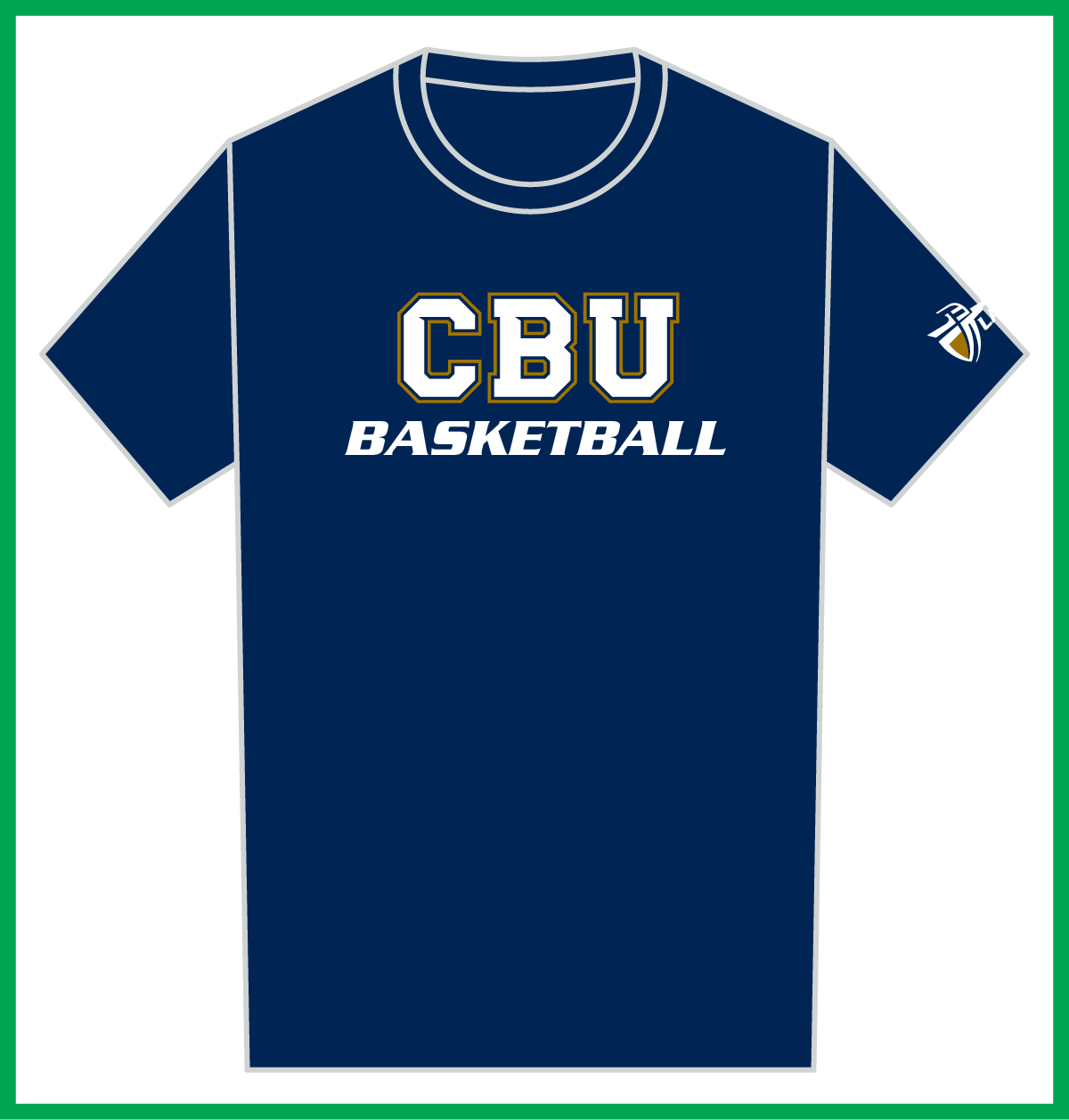
Primary/Secondary Athletic Logo + Official Sport Name in Serpentine Bold Oblique
CBU + Sport Name (Preferred)
This is the preferred logo lock up as it includes the name of the institution.
Use the 3-color variation whenever possible and only use the 1-color version if absolutely necessary.
Sport Logo - CBU Baseball
3-Color | Blue, White, Gold (also available in white, blue, gold)
Sport Logo - CBU Baseball - Simplified
1-Color | Blue (also available in white)
Lancers + Sport Name (Alternative)
This is an alternative sport logo that replaces the institution name with the nickname of the university.
Use the 3-color variation whenever possible and only use the 1-color version if absolutely necessary.
Sport Logo - Lancers Baseball
3-Color | Blue, White, Gold
Sport Logo - Lancers Baseball - Simplified
1-Color | Blue
Usage Guidelines
Follow the guidelines below to ensure consistency in how CBU Athletics sport logos are represented across all platforms, reinforcing recognition, recall, and trust. Use the guide to maintain a cohesive look and feel in every piece of content, regardless of who creates it, thereby preventing errors or misinterpretations.
The guidelines below are current as of 2025 and supersede any previously published brand/style guidelines.
2. Don’t modify the logos / lockups

Never use the sport lockup for non-athletic units.

Never use any font other than Serpentine Bold Oblique.
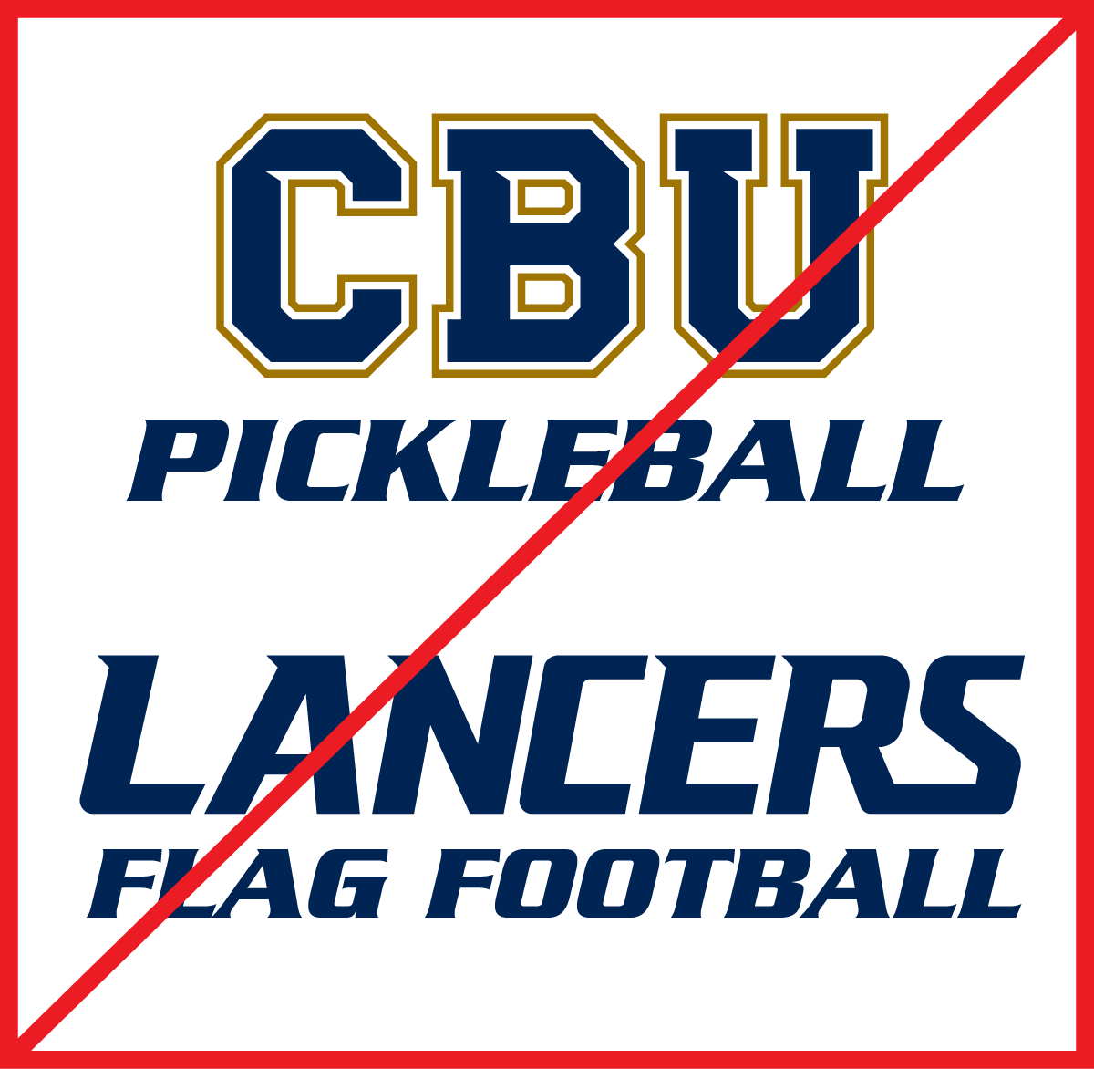
Never use the sport lockup to identify unofficial collegiate sports.
3. Think and design holistically
When creating a capsule / collection of similar merchandise, keep the size of the CBU lettermark consistent (1X).
The length / width of the sport name should never exceed 1.3X the width of the CBU lettermark. In the illustration below, the words “BASKETBALL” and “CROSS COUNTRY” have been proportionately reduced in size from their original lock ups, while “GOLF” retained its original size.
Keep the spacing between CBU lettermark and sport name consistent.
4. Use approved in-game colors
To maintain brand consistency and showcase a unified front, CBU Athletics in-game apparel must use one of the following base colors: navy blue, white, gray, or black. Black garments should be used as a fourth option for coaching/support staff apparel only. It is not permissible for athlete uniforms (e.g., basketball jerseys, swimsuits, golf polos, etc.) to be on a black garment.
Logos used on the garment should utilize the version and color that provides the greatest contrast for maximum legibility.
Any new color requests for apparel branded with CBU Athletics marks must be pre-approved by the Department of Marketing and Communication.

White on blue, blue on white, white on gray, white on black
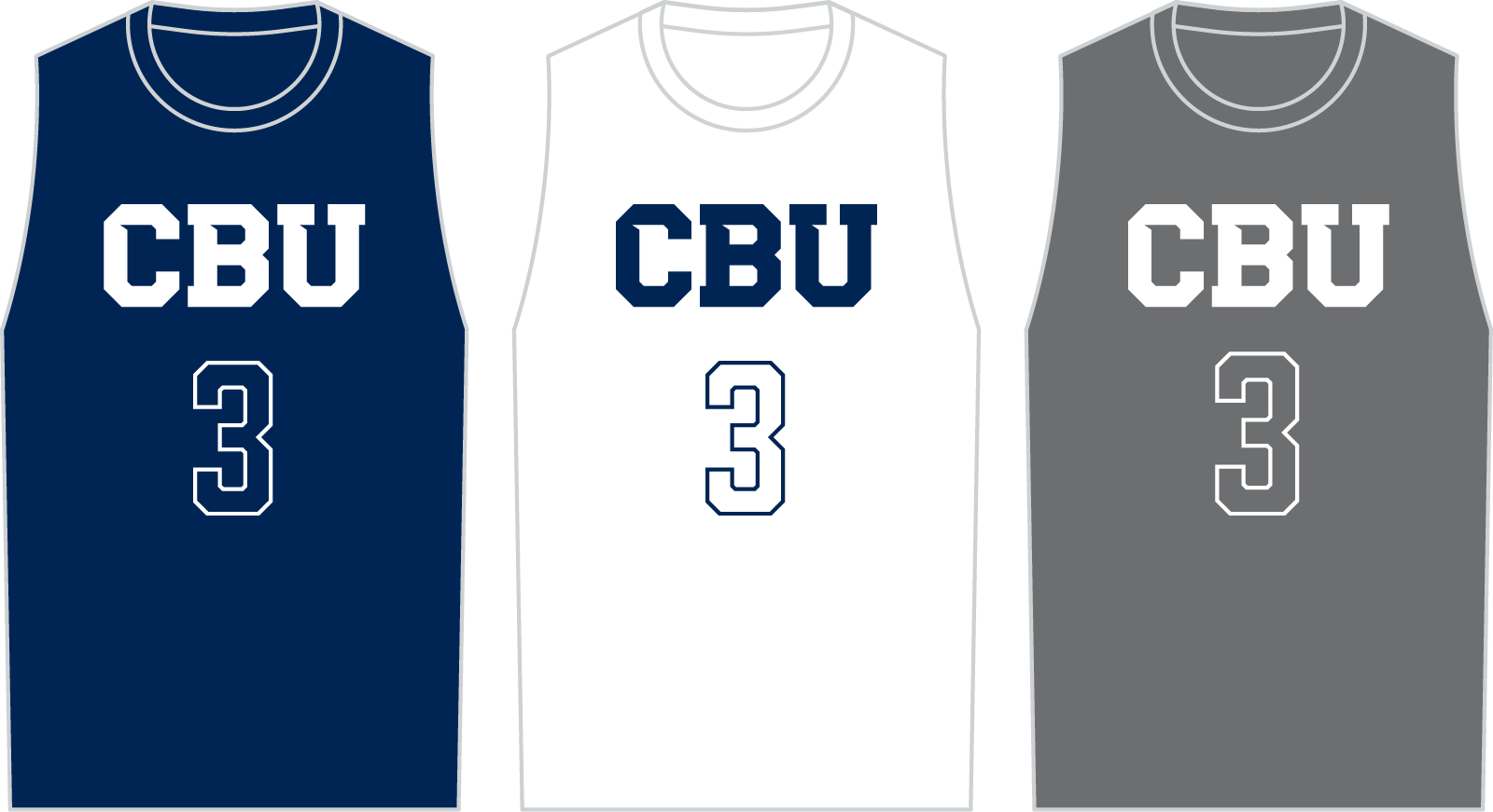
White on navy, navy on white, white on gray
5. Do not combine multiple lock ups
Limit the use of any CBU Athletics logos to one logo, per placement, per garment. If there is a specific need to use multiple logos to satisfy brand guidelines, consider alternate placements on the garment.
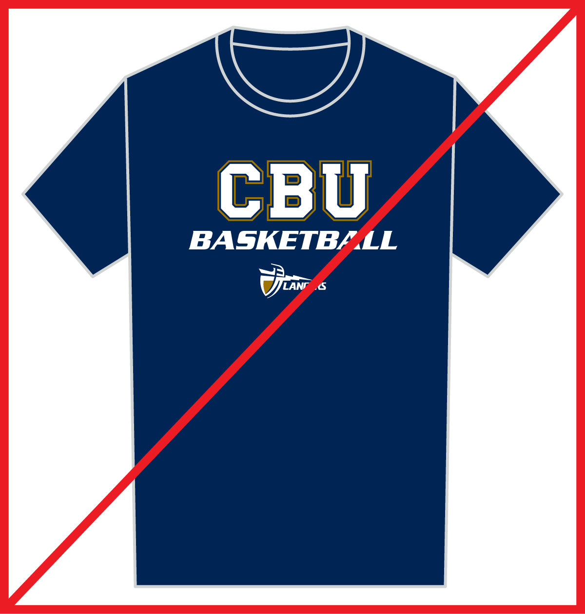
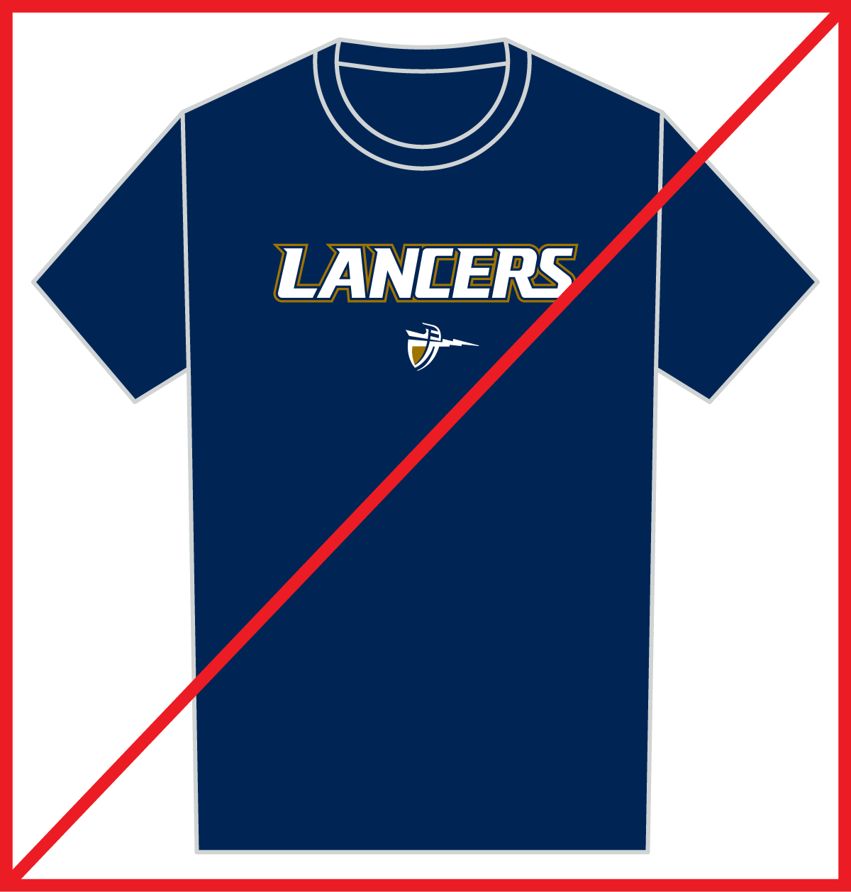
Combining multiple logos to create a single, larger lock up is not permitted unless it’s been pre-designed or pre-approved by the Department of Marketing and Communication.
If it’s necessary to include multiple logos, separate and isolate them to their own locations.