University logo
The university logo is the primary and official logo for California Baptist University. The logo locks up the bell tower icon to the left of the CBU lettermark. This the default identifying mark for all general university / institutional / brand use.
Shown below are the most commonly used university logos and their derivatives.

University Logo - Preferred
3-Color | Blue, White, Gold

University Logo - Negative
2-Color | White, Gold
University Logo
The 3-color university logo is the preferred logo to identify California Baptist University. If only one logo can be used to represent the CBU institution / university / brand, this is the one.
A negative color way of the university logo is available for use over dark background colors. The optimal use of this negative variation is on a navy background.
The use of any other logos to represent the CBU brand must be approved in advance by the Department of Marketing and Communication.
-
All university logo needs, including schools, colleges, departments, offices, and units
All print and digital applications, large or small
Branded merchandise
-
1-color black and white prints (use the simplified 1-color logo instead)

University Logo - Simplified
1-Color | Blue
University Logo – Simplified
A simplified, 1-color university logo is available only if the preferred 3-color or the negative 2-color university logo is unsuitable for the intended application.
-
Single color prints on black and white office printers
Engraving, laser etching, die cut vinyl decals, etc.
Cost-conscious screen printing
-
Digital applications
Print applications where the 3 or 2-color logo can be used
Branded merchandise if another item of the same style already exists bearing the 3 or 2-color logo

Formal University Logo - Horizontal (preferred)
3-Color | Blue, Gold, White

Formal University Logo - Stacked
3-Color | Blue, Gold, White
University Logo – Formal
For circumstances or applications where additional brand clarity is necessary - a formal lockup bearing the full university name is available.
-
Branding use outside of the Riverside area
Circumstances where the CBU abbreviation is insufficient for proper brand identification
-
1-color black and white prints (use the simplified 1-color logo instead)
Usage Guidelines
Follow the guidelines below to ensure consistency in how the university logo is represented across all platforms, reinforcing recognition, recall, and trust. Use the guide to maintain a cohesive look and feel in every piece of content, regardless of who creates it, thereby preventing errors or misinterpretations.
The guidelines below are current as of 2025 and supersede any previously published brand / style guidelines.
1. Do not use outdated logos
In our history, there have been moments of institutional progress that required CBU to change or update our logo.
In 2003 the original and still current bell tower icon, CBU lettermark, and Lancers wordmark were designed. In 2017 the rise and success of CBU’s athletic programs culminated in the opening of the Events Center. During that time, the need for a center-court logo on the basketball court arose. The lowercase CBU letters in our logo were replaced with uppercase / block letters. In 2021, the CBU logo once again received subtle and important improvements to optimize its appearance and clarity, especially on smaller, digital screen sizes.
See the illustrations below to distinguish the old from the new. When in doubt, re-download CBU brand assets from the asset library to ensure you have the latest version.

2003 - CBU belltower icon and lowercase CBU lettermark were created. Now outdated.

2017 - CBU lettermark updated to uppercase. Lancers wordmark updated. Now outdated.

2021 - CBU lettermark and institutional logo updated.

Differences between the 2017 and the current (2021) CBU logo may be subtle but they are different nonetheless.

This overlay highlights the letterform differences between the old letters (in red) and updated letters.

This logo was replaced in 2017.
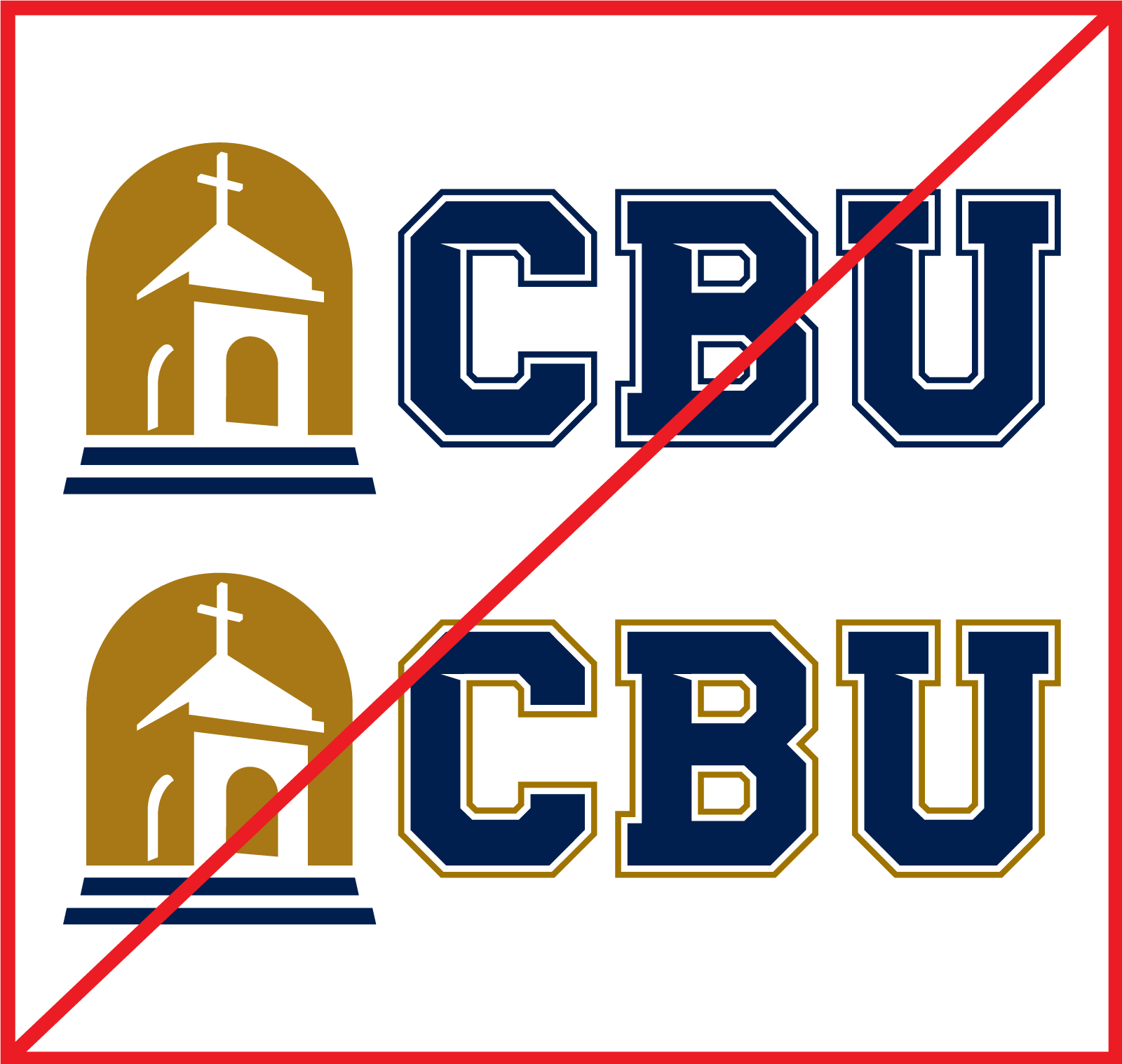
These 2017 logo variations were eliminated in 2021.
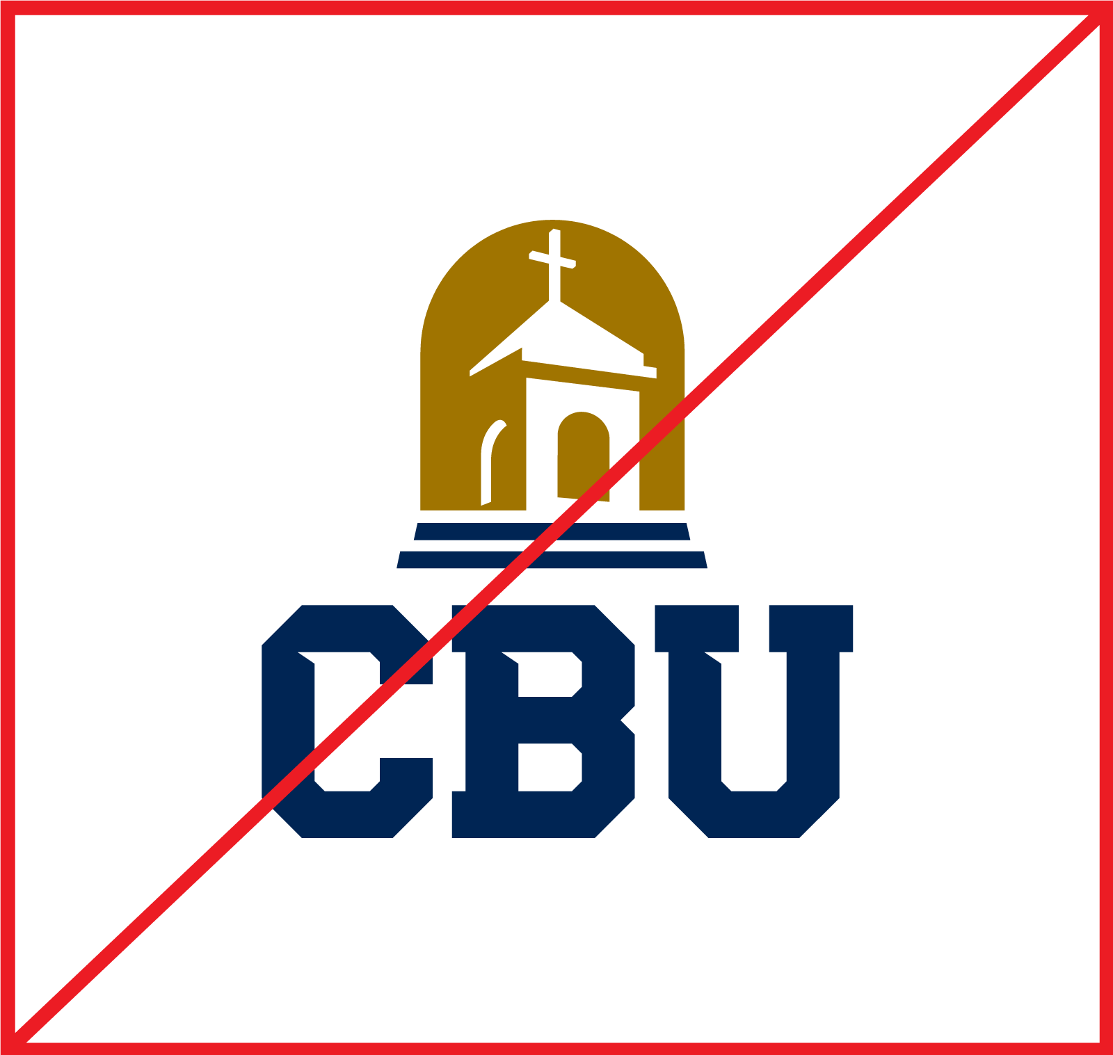
The stacked logo was discontinued in 2022
2. Maintain clear space
Give the logo room to breathe by adding clear space. Clear space is defined as the area around the logo devoid of other logos, typography, graphics, and messaging. This area of isolation ensures the logo stands out, and other design elements do not encroach on it, or visually compete with it. Maintain clear space as wide as the letter C.
This general rule applies to all CBU related logos.

3. Never modify the logo
The logo has been intentionally arranged, sized, and colored to represent the CBU brand. For those reasons, the elements within the logo should never be stretched, skewed, recolored, or otherwise modified.
The rules below apply to all other marks and logos within this visual style guide.

Never change the colors of the logo.
Never delete any colors from the logo.
Note: With the exception of the 1-color CBU logo, the bell tower silhouette is always white, never hollow or knocked-out.
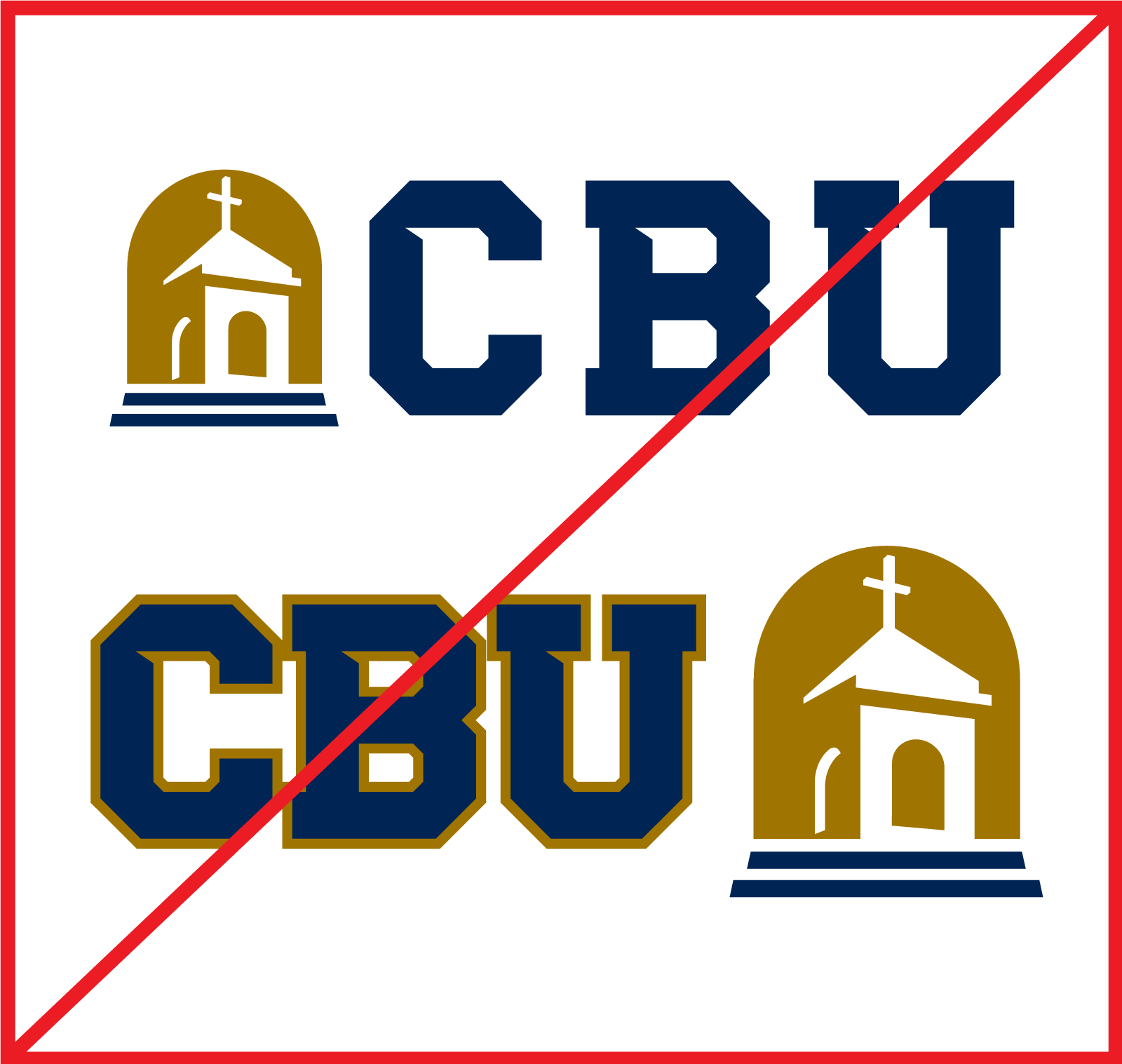
Never change the spacing or sizing of the logo elements.
Never add additional colors or change the logo order.

Never distort or stretch the logo.
Never rotate the logo or use the logo on an angle.