Signage
Physical signage is crucial for a university because it serves as both a navigational tool and a canvas for brand expression. Effective signage helps students, staff, and visitors traverse the campus with ease, creating a welcoming and intuitive environment that supports daily life and academic success.
From a wayfinding perspective, clear and consistent signs reduce confusion, enhance safety, and ensure that all individuals, including those with disabilities, can navigate efficiently.
From a branding perspective, each sign is an opportunity to reinforce the university’s identity, values, and commitment to excellence, leaving a lasting impression on everyone who steps onto campus. Thoughtfully designed signage tells a story about the institution – its history, culture, and forward-thinking vision – which in turn fosters a sense of pride and belonging.
Physical signage is not just about directions; it is an integral part of the campus experience and a key element in shaping how the university is perceived both internally and externally.
Exterior - Marquee Building Signs
All building signs are written in title case format and stylized in small caps – as shown on illustration 1 A.
Small cap letters are sized at 85% of the height of the capital letters – as shown on illustration 1 B.
Color: Pantone 405U
Font: Sabon LTD Roman Bold
Tracking: 175PTS

Illustration 1 A
CBU Recreation Center Building Sign

Illustration 1 B
Small caps at 85% scale
Interior - Office Signs
Microsoft Word templates for various sizes of office sign holders are available to download using the link below.
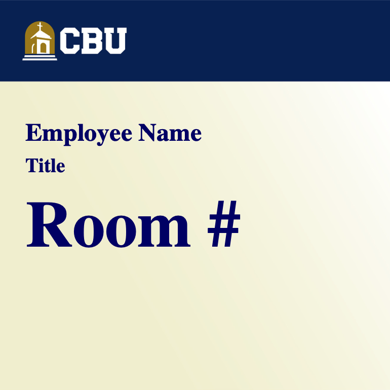
University Office Sign
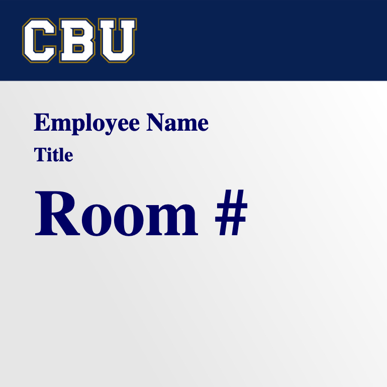
Athletics Office Sign
Advertising / Promotional Signs
Internal-facing, on-campus, advertising signs must adhere to the rules and regulations established by Student Services and Marketing and Communication.
Usage Guidelines
Following physical signage style guidelines ensures a consistent visual identity that strengthens brand recognition and trust across all campus areas. This uniformity improves wayfinding by making signs instantly recognizable and easier to navigate, thereby enhancing the overall user experience. Additionally, adhering to these guidelines maintains high standards of design and functionality, which reflects the institution’s commitment to excellence and professionalism.
1. Consider your audience before using a CBU logo / mark
CBU logos / marks should be more prevalent on external-facing signs than on internal-facing signs. Once your audience is on-campus, logo use should be minimized / removed altogether.